Falar sobre prevenção ao HIV sem travamento: mais difícil do que parece Talking about HIV prevention without inhibitions: harder than it sounds
Um site sobre prevenção ao HIV com identidade visual ousada e público LGBTQIA+ no centro. O maior desafio não foi o design — foi convencer o cliente. An HIV prevention platform with bold visual identity and the LGBTQIA+ community at its center. The hardest part wasn't the design — it was convincing the client.

O contexto
Quando estava na 2t's, agência boutique focada em marketing farmacêutico, a gente raramente trabalhava com projetos que tinham a chance de ser genuinamente diferentes. A maior parte do trabalho era material promocional B2B para equipes de venda — funcional, correto, sem muita margem criativa. O Combinar Rola chegou diferente.
O cliente era a Blanver, laboratório farmacêutico com foco em medicamentos para ISTs. O produto em pauta: a estratégia de prevenção combinada ao HIV — PrEP, PEP e preservativo usados juntos. O público-alvo principal era a comunidade LGBTQIA+, especialmente HSH (homens que fazem sexo com homens). E a missão era criar uma plataforma digital que instruísse esse público a procurar um médico para conversar sobre prevenção, sem medo e sem tabu.
O problema
O desafio tinha duas camadas, e elas puxavam em direções opostas.
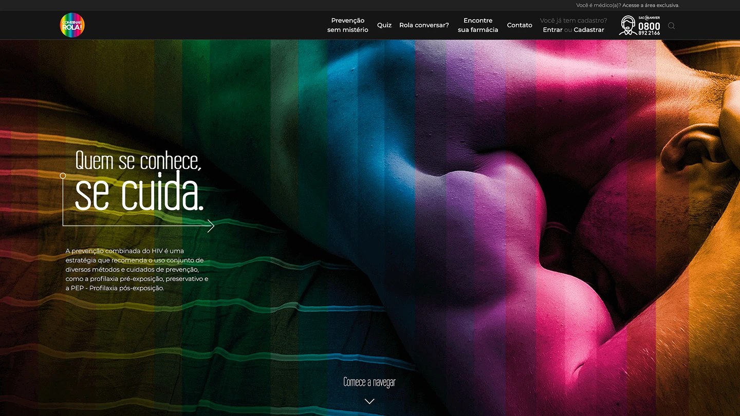
A camada de comunicação: como você fala sobre sexo, preservativo e profilaxia para um público que historicamente foi estigmatizado — e ao mesmo tempo mantém o tom leve, acolhedor, sem parecer campanha governamental genérica? A solução criativa veio do diretor de arte da agência: o nome "Combinar Rola!", um trocadilho sexual declarado, com identidade visual ousada, fotografia real do público e uma estética que misturava neon com a paleta do arco-íris. Funcionou. O nome pegou, o conceito pegou, e o público LGBTQIA+ respondeu bem à abordagem sem rodeios.
A camada do cliente: a Blanver tinha uma visão mais conservadora do que o briefing sugeria. Havia uma tensão constante entre a proposta criativa da agência e o conforto do aprovador interno. Nada na plataforma promovia medicamentos diretamente — o foco total era incentivar o usuário a procurar um médico para ter essa conversa. Mas o simples fato de falar sobre PrEP e PEP de forma acessível e sem eufemismos gerava fricção nas aprovações. Um exemplo concreto: o nome de domínio "combinarrola.com.br" foi pensado desde o início como parte da identidade, mas o cliente não aprovou. O site foi ao ar em prevencaocombinada.com.br — funcionalmente o mesmo, mas sem aquele punch que o nome trazia.
Esse tipo de tensão entre o que é criativamente certo e o que o cliente aceita aprovar é algo que quem trabalha em agência conhece bem. Aqui ela estava presente o tempo todo.
O processo
Meu papel no projeto foi triplo: UI Design, desenvolvimento front-end e edição do vídeo de divulgação. O diretor de arte da agência definiu a identidade visual e eu fui responsável por implementar e adaptar — com liberdade razoável para resolver problemas que surgiam na tradução do guide para o produto digital.
A identidade visual do Combinar Rola trabalhava com uma combinação incomum para o contexto farmacêutico: fotografias reais de casais e pessoas do público LGBTQIA+, sobrepostas com elementos neon e a paleta do arco-íris. O resultado tinha energia, calor e ousadia — exatamente o oposto da linguagem clínica que se espera de um projeto de saúde. Manter essa energia na tradução para web, com todos os constraints de tipografia, responsividade e acessibilidade, foi o principal exercício de design.
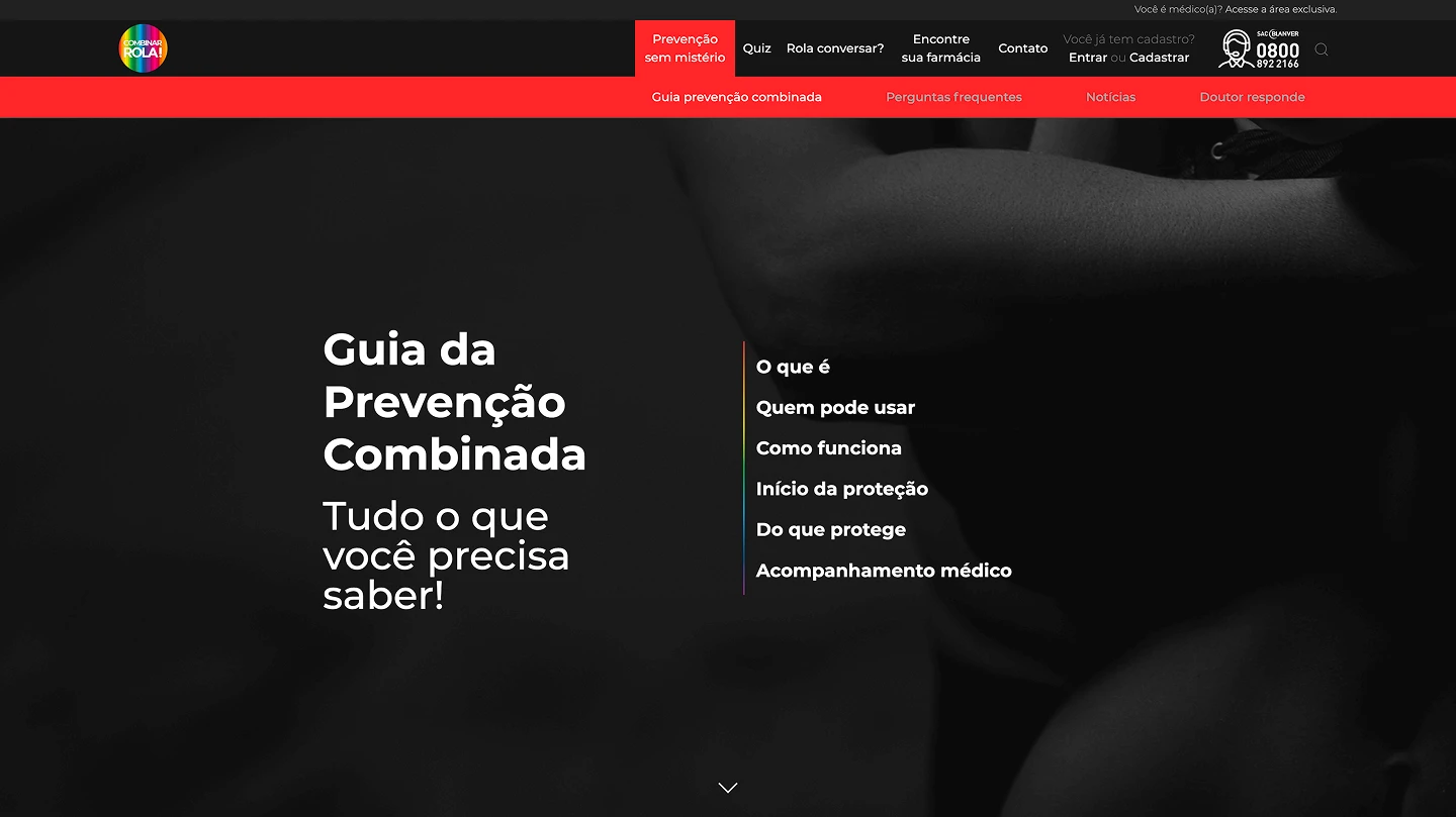
O site tinha três públicos distintos e precisava servir todos de forma coesa: o público geral (que chegava curioso sobre prevenção), as pessoas LGBTQIA+ que já tinham algum conhecimento e queriam se aprofundar, e médicos — que tinham uma área exclusiva com materiais de apoio sobre a medicação e acesso a recursos clínicos. Navegar por essa arquitetura de informação sem criar um site que parecesse dividido em três produtos diferentes foi um trabalho cuidadoso de hierarquia e fluxo.
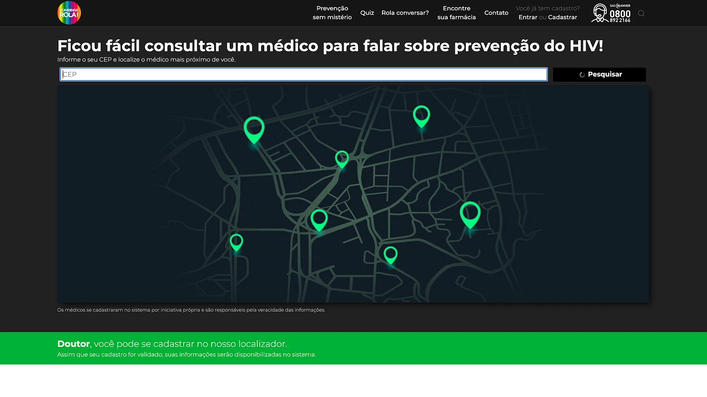
O localizador de médicos era uma das funcionalidades centrais: o usuário informava o CEP e o sistema exibia os profissionais cadastrados mais próximos que podiam conversar sobre prevenção combinada. Havia também uma área para que médicos se cadastrassem no sistema, com validação de dados para garantir a qualidade dos resultados. Implementei essa integração no front-end, garantindo que a experiência fosse fluida mesmo em conexões mais lentas — algo relevante para um público que muitas vezes acessa via mobile.
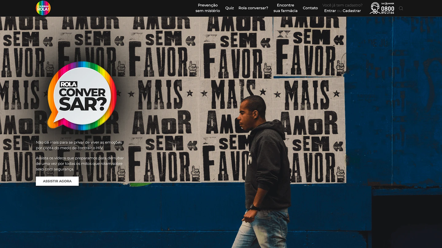
O vídeo de divulgação foi um trabalho paralelo ao site. Um clipe de 23 segundos, editado por mim, com o objetivo de circular nas redes sociais e atrair o público para a plataforma. O tom era o mesmo do site: direto, sem drama clínico, com energia da comunicação urbana. Não era um vídeo de saúde pública — era um convite para uma conversa.
O resultado
O site foi ao ar e a plataforma funcionou como previsto: conteúdo educativo sobre PrEP, PEP e prevenção combinada, localizador de médicos, área exclusiva para profissionais de saúde, e um vídeo de divulgação rodando nas redes. A campanha teve ativação também nas redes sociais, com materiais que eu produzi para o lançamento.
O Combinar Rola era um projeto com potencial de ser referência em comunicação de saúde inclusiva no Brasil. A identidade foi bem executada, o conceito funcionou, e o público que chegou à plataforma encontrou uma experiência muito diferente do que costuma existir nesse segmento. A limitação foi a mesma de sempre em projetos assim: quanto a ousadia criativa consegue sobreviver ao processo de aprovação.
O site hoje não está mais no ar.
O que eu aprendi
Contexto regulatório não é inimigo do design — mas precisa ser entendido cedo. A tensão com o cliente ao longo do projeto veio em grande parte de expectativas desalinhadas sobre o que podia e o que não podia ser comunicado. Entender os limites regulatórios de comunicação farmacêutica desde o briefing — e não descobrir nas aprovações — teria economizado ciclos inteiros de revisão.
Identidade visual ousada precisa de cliente corajoso. O conceito do Combinar Rola funcionou. O nome, a fotografia, a linguagem — tudo era coeso e adequado ao público. Mas o impacto real de um projeto como esse depende de o cliente comprar o conceito inteiro, não só a parte que é confortável. Quando isso não acontece, o produto final é um meio-termo.
Ser o único responsável por design e desenvolvimento te dá velocidade e te cobra caro. Com o papel de UI + front-end, eu tinha controle total sobre o que era entregue e velocidade de iteração. Mas também não tinha par de olhos para revisar, validar ou questionar decisões. É um trade-off que aprendi a reconhecer desde cedo.

The context
When I was at 2t's — a boutique agency focused on pharmaceutical marketing — we rarely worked on projects that had the chance to be genuinely different. Most of the work was B2B promotional material for sales teams: functional, correct, and creatively constrained. Combinar Rola was different.
The client was Blanver, a pharmaceutical lab specializing in STI medications. The product: a combined HIV prevention strategy — PrEP, PEP, and condoms used together. The primary audience was the LGBTQIA+ community, especially MSM (men who have sex with men). The goal was to create a digital platform that would encourage this audience to seek a doctor to talk about prevention — openly, without fear or stigma.
The problem
The challenge had two layers pulling in opposite directions.
The communication layer: how do you talk about sex, condoms, and prophylaxis to an audience that's historically been stigmatized — while keeping the tone light, welcoming, and nothing like a generic government campaign? The creative solution came from the agency's art director: the name "Combinar Rola!" — a deliberate sexual double entendre — paired with a bold visual identity, real photography of the target audience, and an aesthetic that blended neon with rainbow colors. It worked. The name landed, the concept landed, and the LGBTQIA+ community responded well to the no-nonsense approach.
The client layer: Blanver's internal vision was more conservative than the brief suggested. There was constant friction between the agency's creative proposal and the client's comfort zone. Nothing on the platform directly promoted medication — the entire focus was on encouraging users to talk to a doctor. But simply discussing PrEP and PEP in accessible, plain language kept generating pushback during reviews. One concrete example: the domain "combinarrola.com.br" was part of the brand concept from day one, but the client didn't approve it. The site launched at prevencaocombinada.com.br — functionally identical, but without the punch the name carried.
This kind of tension between what's creatively right and what the client is willing to approve is something everyone in agency work knows. On this project, it was present throughout.
The process

My role on the project was threefold: UI design, front-end development, and editing the promotional video. The agency's art director defined the visual identity, and I was responsible for implementing and adapting it — with reasonable freedom to solve problems that came up in the translation from brand guide to digital product.
The Combinar Rola visual identity worked with an unusual combination for pharmaceutical context: real photographs of LGBTQIA+ couples and individuals, overlaid with neon elements and a rainbow palette. The result had energy, warmth, and boldness — the exact opposite of the clinical aesthetic you'd normally expect from a health project. Maintaining that energy in the web translation, within all the constraints of typography, responsiveness, and accessibility, was the main design exercise.

The site had three distinct audiences and needed to serve all of them coherently: general visitors curious about prevention, LGBTQIA+ individuals with existing knowledge who wanted to go deeper, and doctors — who had an exclusive area with clinical support materials and access to professional resources. Navigating that information architecture without making the site feel like three separate products was a careful exercise in hierarchy and flow.

The doctor locator was one of the core features: users entered their zip code and the system displayed nearby registered professionals who could discuss combined prevention. There was also a doctor registration area, with data validation to ensure result quality. I implemented this integration on the front-end, making sure the experience was smooth even on slower connections — relevant for an audience that often accesses via mobile.

The promotional video was a parallel effort alongside the site. A 23-second clip I edited, designed to circulate on social media and drive traffic to the platform. The tone matched the site: direct, no clinical drama, with urban communication energy. It wasn't a public health video — it was an invitation to a conversation.
The outcome
The site launched and the platform worked as intended: educational content about PrEP, PEP, and combined prevention; a doctor locator; an exclusive area for healthcare professionals; and a promotional video running on social media. The campaign also had social media activation, with content I produced for the launch.
Combinar Rola had the potential to be a reference for inclusive health communication in Brazil. The identity was well-executed, the concept worked, and the audience that reached the platform encountered something very different from what typically exists in this space. The limitation was the same one that shows up in projects like this: how much creative boldness can survive the approval process.
The site is no longer live.
What I learned
Regulatory context isn't the enemy of design — but it needs to be understood early. Much of the client friction throughout the project came from misaligned expectations about what could and couldn't be communicated. Understanding pharmaceutical communication regulations from the brief stage — rather than discovering them during review cycles — would have saved significant time.
Bold visual identity requires a brave client. The Combinar Rola concept worked. The name, the photography, the language — all cohesive and appropriate for the audience. But the real impact of a project like this depends on the client buying into the full concept, not just the comfortable parts. When that doesn't happen, the final product becomes a compromise.
Being the sole person responsible for both design and development gives you speed and costs you something. With UI + front-end as my dual role, I had full control over what was delivered and fast iteration cycles. But I also had no second pair of eyes to review, validate, or challenge decisions. It's a trade-off I learned to recognize early on.
Todo o conteúdo, imagens e materiais apresentados neste case são de autoria de Victor Oliveira Franco e/ou das empresas para as quais foram produzidos. A reprodução, cópia ou distribuição sem autorização prévia e expressa está sujeita a medidas legais conforme a legislação de direitos autorais vigente.
All content, images and materials presented in this case study are authored by Victor Oliveira Franco and/or the companies for which they were produced. Reproduction, copying or distribution without prior and express authorization is subject to legal action under applicable copyright law.