Alto padrão do zero: quando luxo imobiliário virou obsessão de layout High-end from scratch: when luxury real estate became a layout obsession
Um residencial de 8 casas em Alto de Pinheiros, assinado por Patricia Anastassiadis. Meu trabalho foi fazer o site e os materiais impressos serem tão sofisticados quanto o empreendimento. An 8-home residential project in São Paulo's finest neighborhood, designed by Patricia Anastassiadis. My job was to make the website and printed materials as refined as the development itself.
O contexto
Quando entrei na Urca Design, no começo de 2017, eu ainda estava aprendendo o que significa trabalhar com design de verdade — aquele que existe além do curso, do Dribbble, das referências salvas. A agência era pequena, boutique mesmo, especializada em imobiliário. E o SERENO foi, sem exagero, o projeto que moldou como eu enxergo design até hoje.
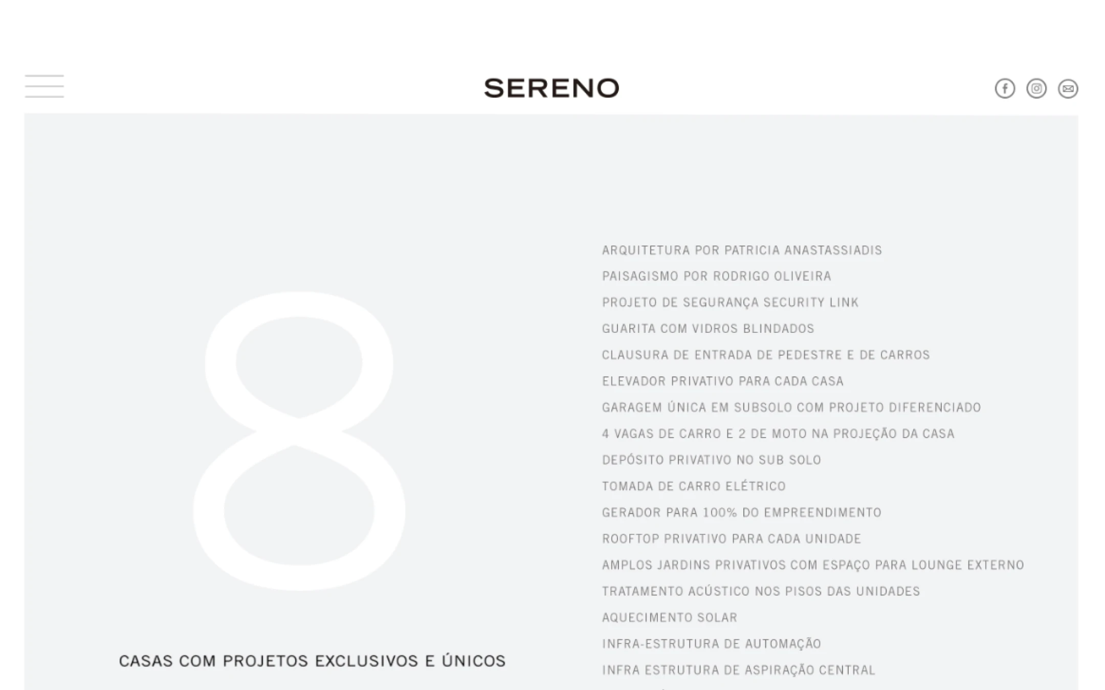
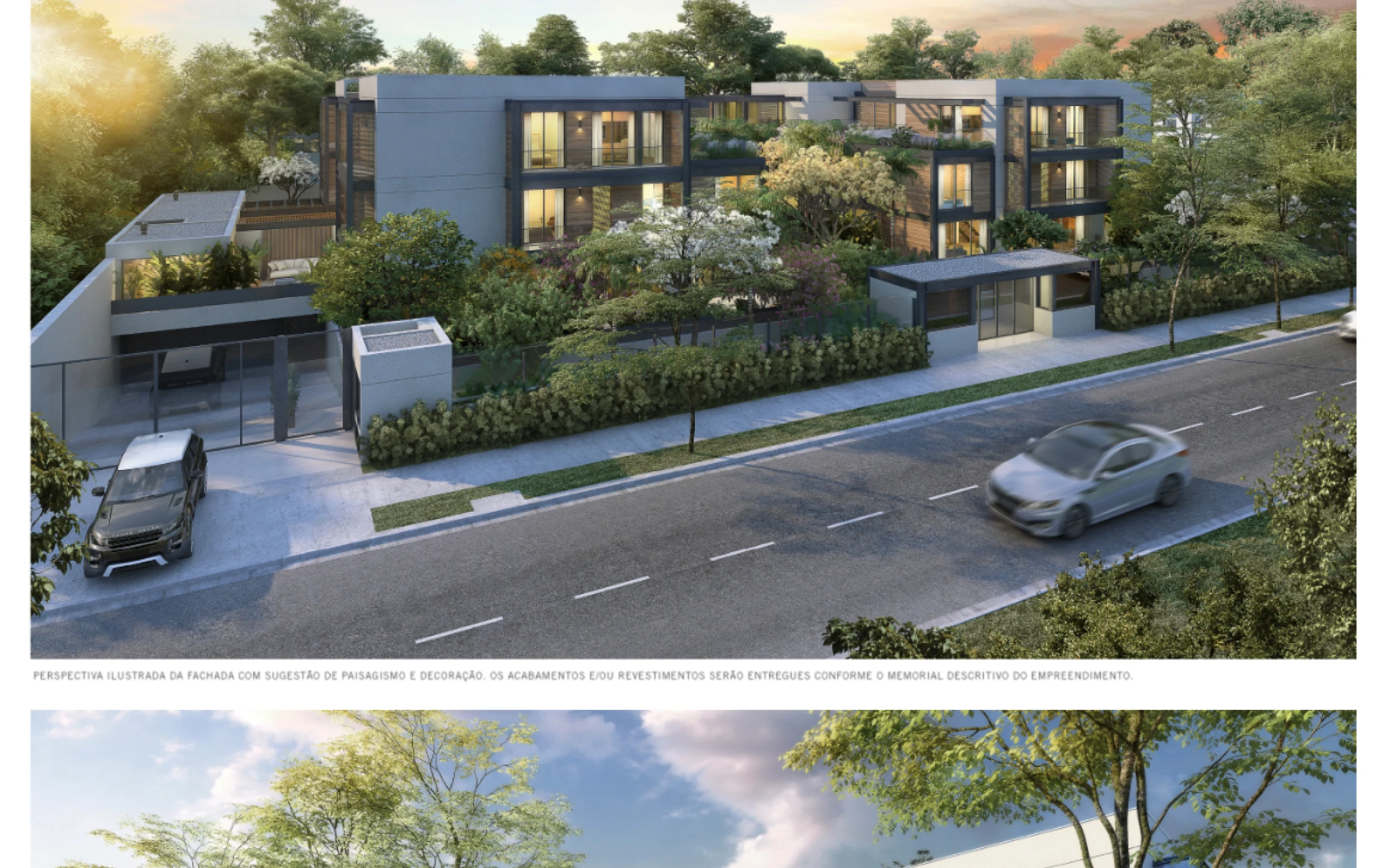
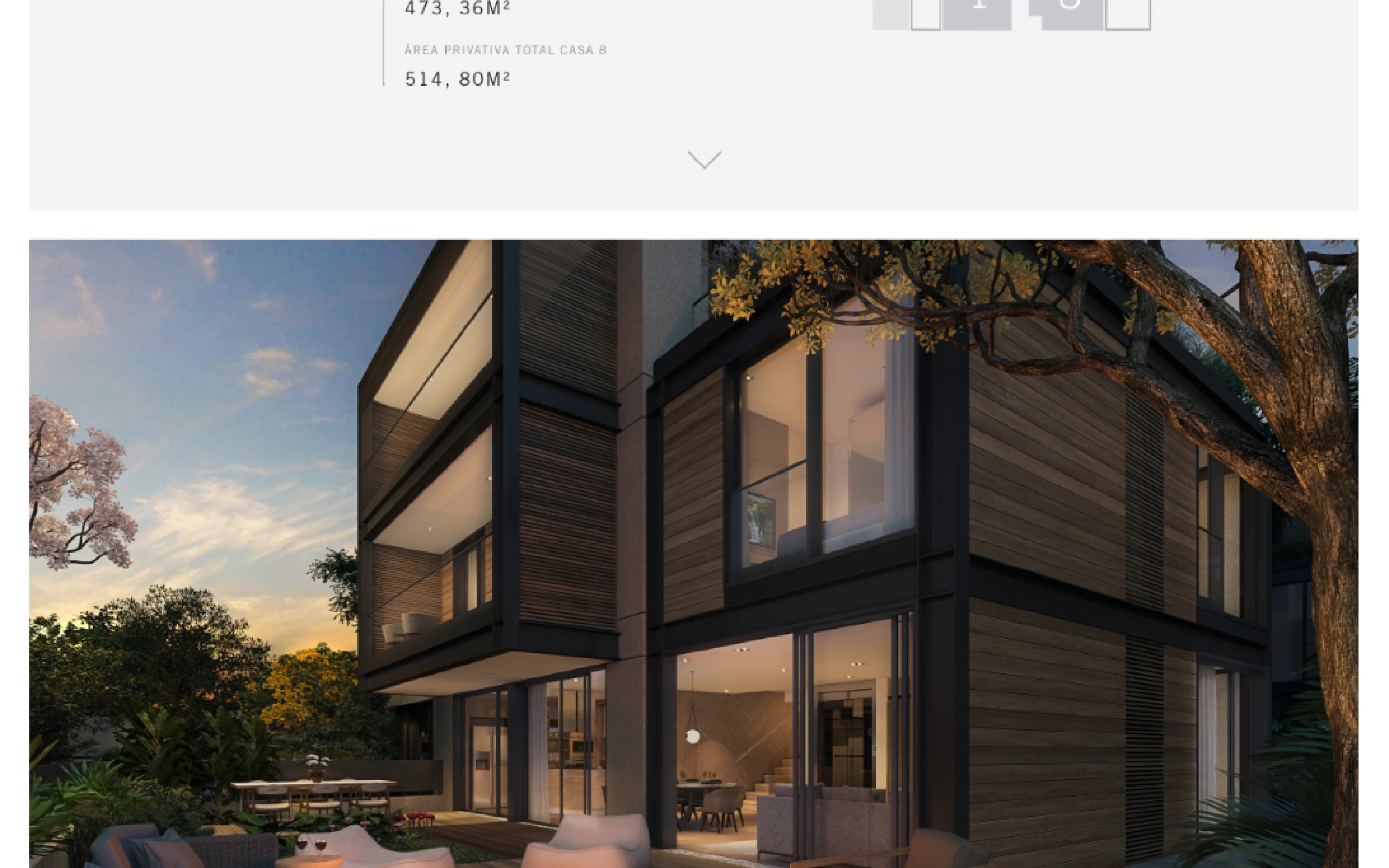
O empreendimento em si já era excepcional: 8 casas exclusivas em Alto de Pinheiros, bairro mais arborizado de São Paulo segundo dados do MIT Senseable City Lab. Arquitetura e interiores assinados por Patricia Anastassiadis, uma das arquitetas mais respeitadas do Brasil. Incorporação pela JAL, com participação de Alfa Realty, Cariba e Moriah. Casas entre 473 e 516m², com 4 dormitórios, garagem privativa subterrânea e cobertura exclusiva. Preço? Uma das unidades apareceu depois no Viva Real por R$ 6,7 milhões. Não é todo dia que você entra nesse universo.
O desafio
O produto vendia por si só — arquitectura impecável, localização privilegiada, nome de peso na assinatura. O que o SERENO precisava era de uma presença digital e de materiais gráficos que estivessem à altura. Que não parecessem mais um lançamento imobiliário com aquele visual genérico de "sofás bege e fonte serif". Tinha que ser refinado. Tinha que ser diferente. Tinha que combinar com Patricia Anastassiadis.
O site: precisava funcionar como um editorial de arquitetura, não como um hotsite de vendas. A ideia era contar a história do empreendimento — o bairro, a arquitetura, os espaços — de forma que o visitante sentisse o nível antes mesmo de ver uma planta.
Os impressos: book de vendas, materiais de stand, folder, plantas diagramadas. Peças que seriam entregues em mãos para compradores em potencial com perfil de altíssima renda. Papel de gramatura alta, acabamento impecável, zero margem para erro.


O processo
Identidade visual no site
A paleta surgiu quase naturalmente do conceito do empreendimento: off-white quente como base, verde-musgo referenciando a arborização densa do bairro, grafite para tipografia. A fonte escolhida era geométrica, espaçada, neutra — sem personalidade excessiva, justamente para deixar as imagens e o produto falarem. O logotipo SERENO em caixa-alta com tracking generoso já dizia tudo sobre o posicionamento.
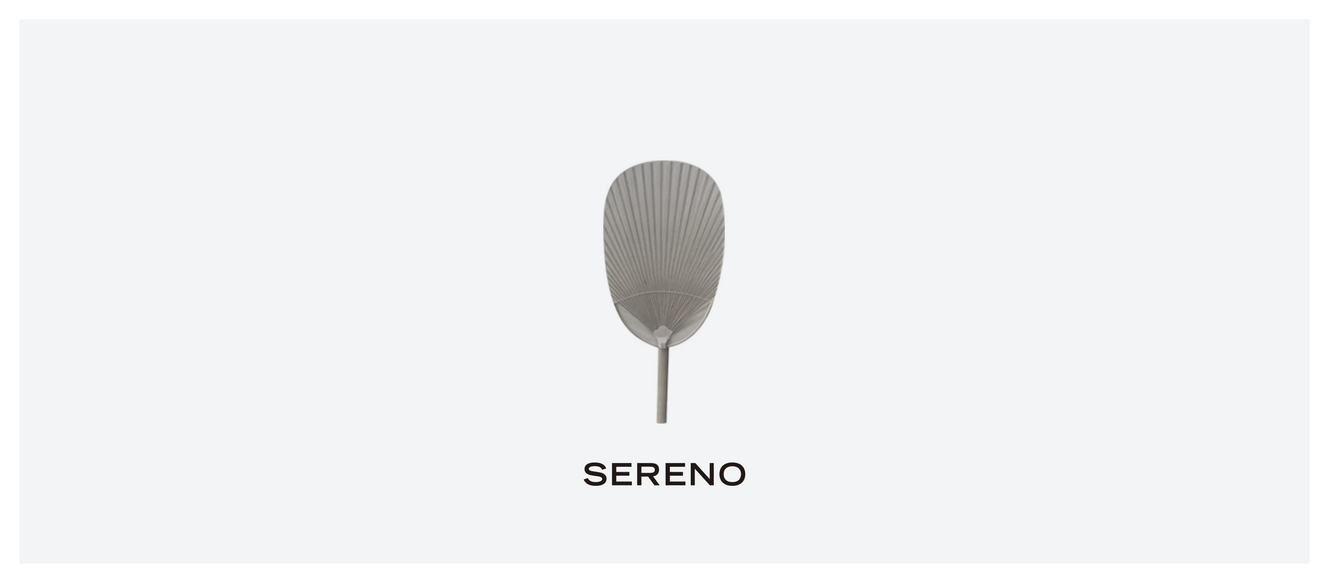
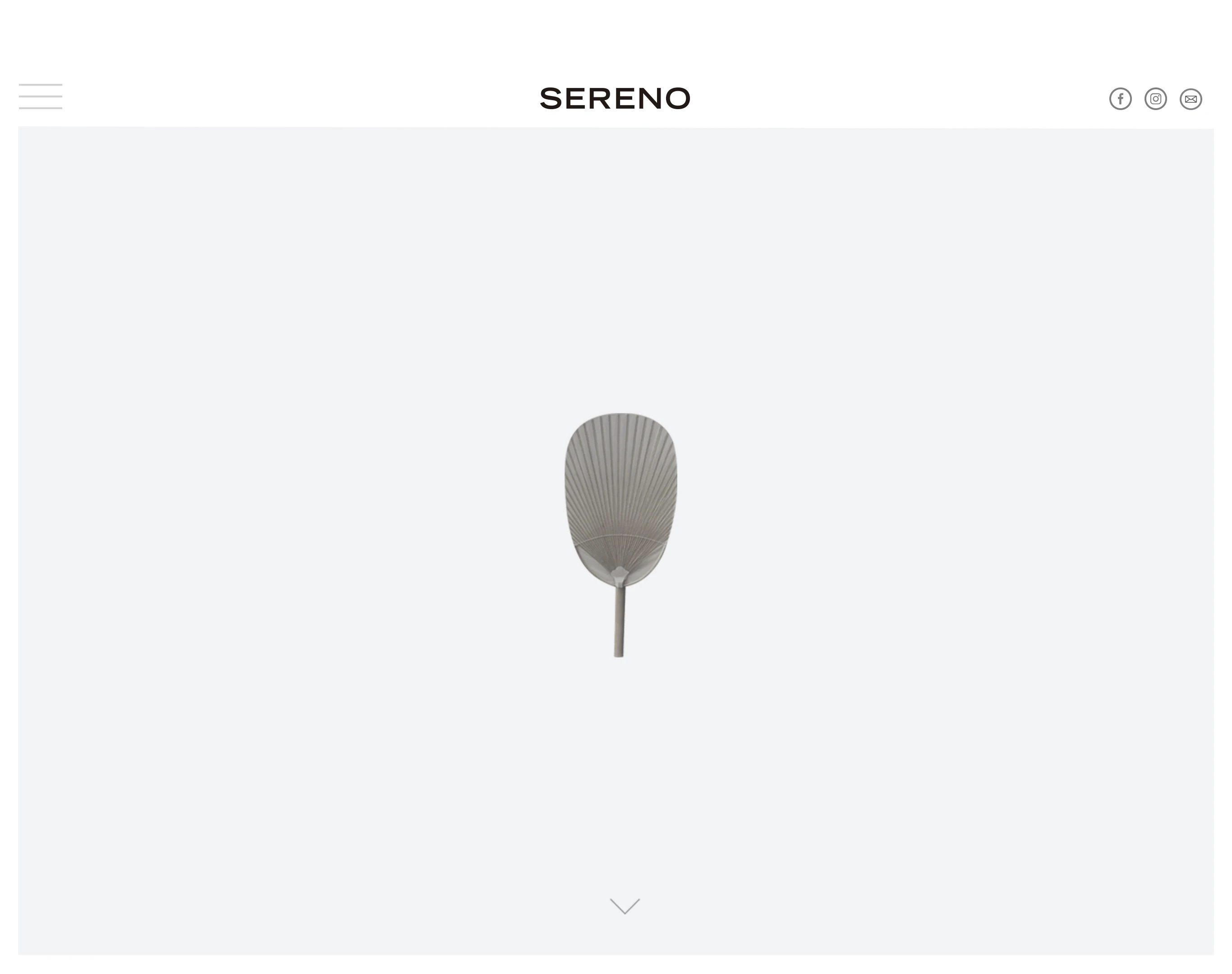
O hero era um abanador de palha — um objeto artesanal, discreto, de alto padrão — centralizado em um fundo quase branco. Nada mais. Nenhum texto além do nome. A sofisticação estava exatamente no que não estava lá.
Para o front-end, usei HTML, CSS e jQuery com UIKit como framework base. A lógica de scroll, as transições entre seções e os microdetalhes de interação foram todos construídos para reforçar a sensação de fluidez — como folhear uma revista de arquitetura de alto padrão, não navegar num site.
Arquitetura da informação
O site não tinha uma página de produto convencional. Cada seção era uma camada da história: primeiro o bairro (o mapa do MIT com Alto de Pinheiros destacado como o mais arborizado da cidade), depois o empreendimento em si, depois as casas, depois a arquiteta, depois as incorporadoras, e por fim o contato.
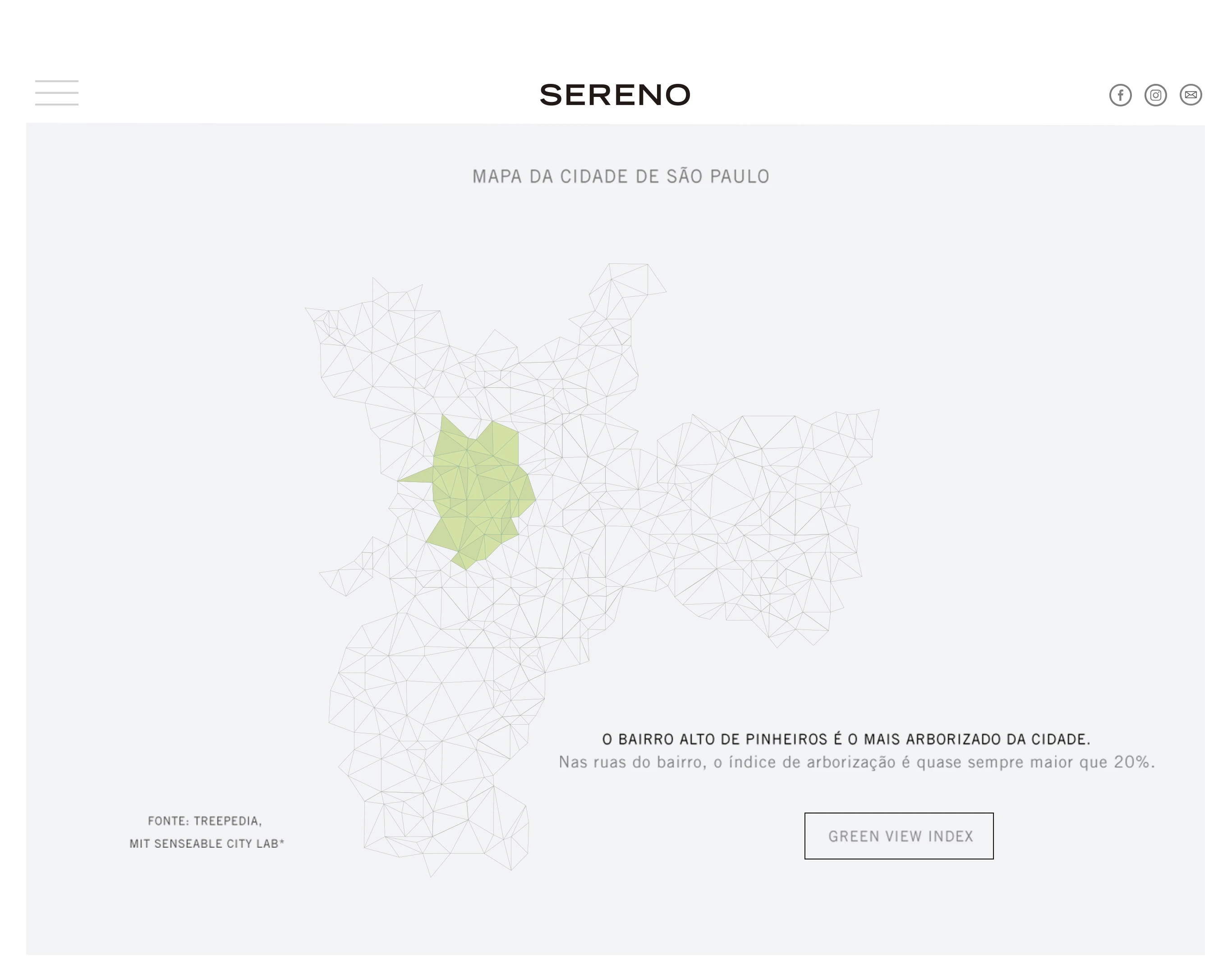
A seção do "Green View Index" com o mapa low-poly de São Paulo foi um dos momentos que mais me orgulho nesse projeto. Transformar um dado científico — o índice de arborização de ruas compilado pelo MIT Senseable City Lab — em um elemento visual da identidade do produto. Não era só informação, era argumento de venda embrulhado em design.
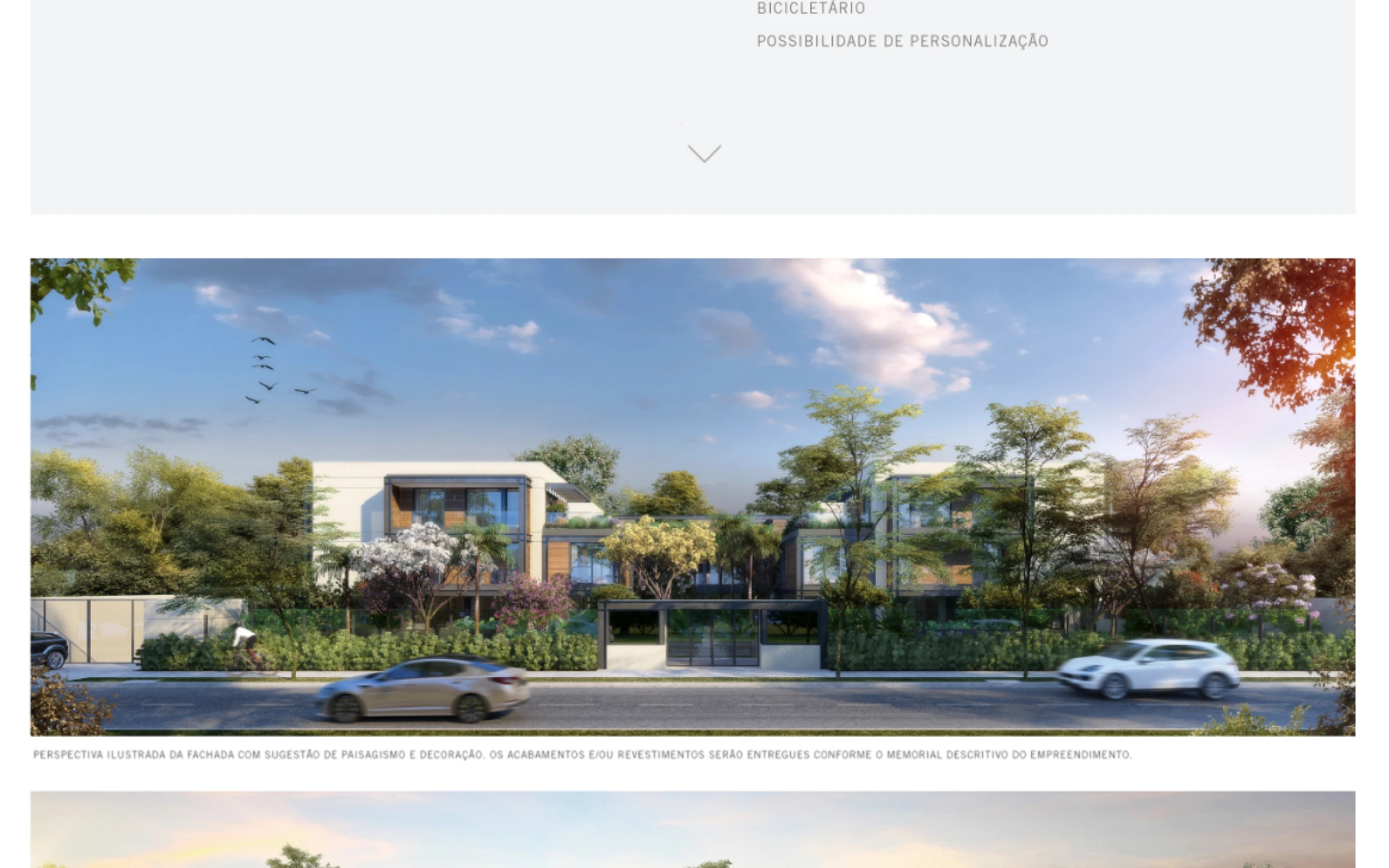
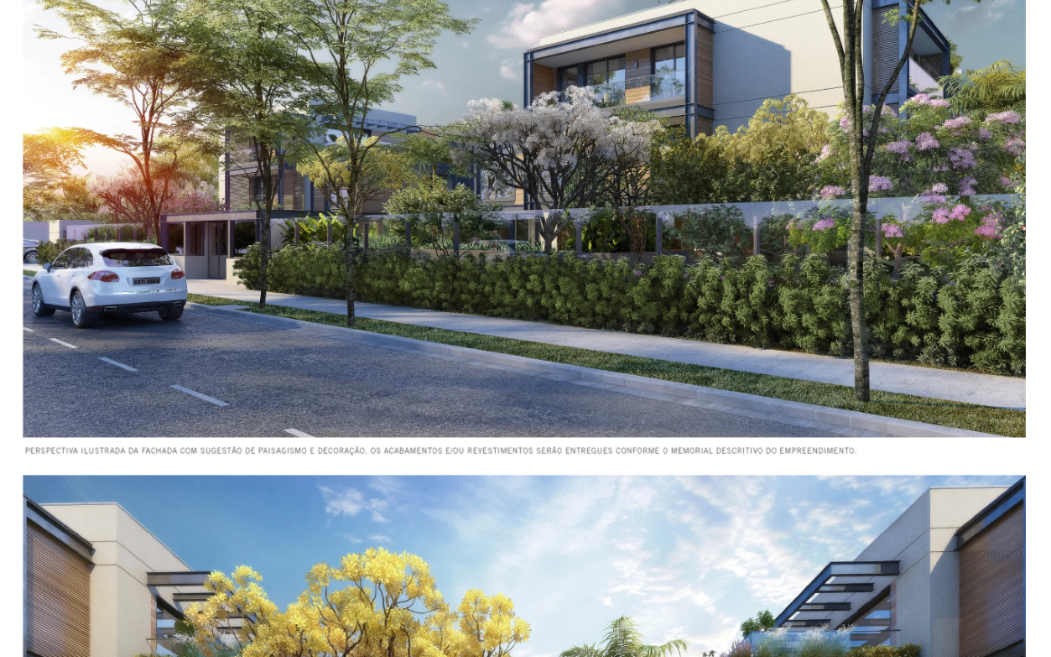
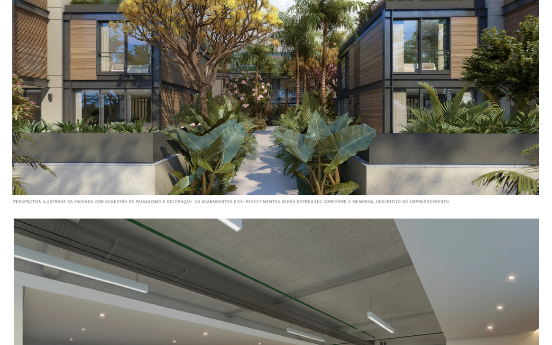
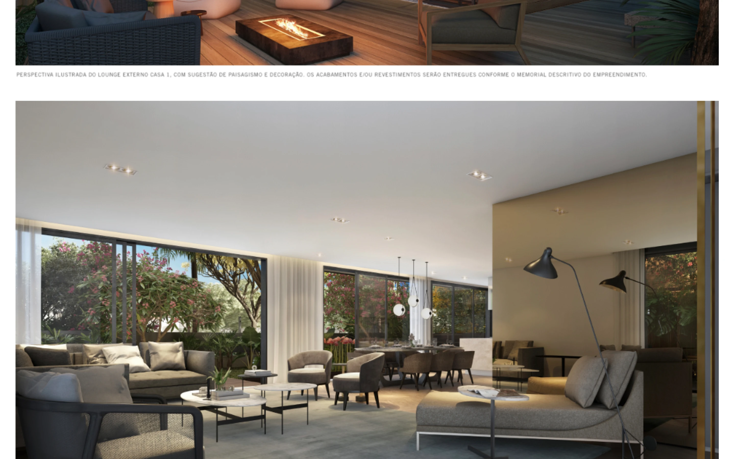
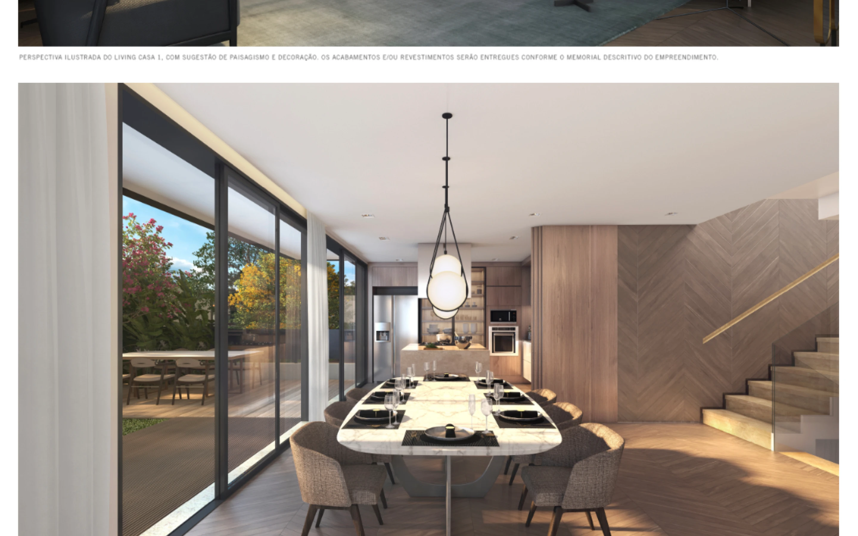
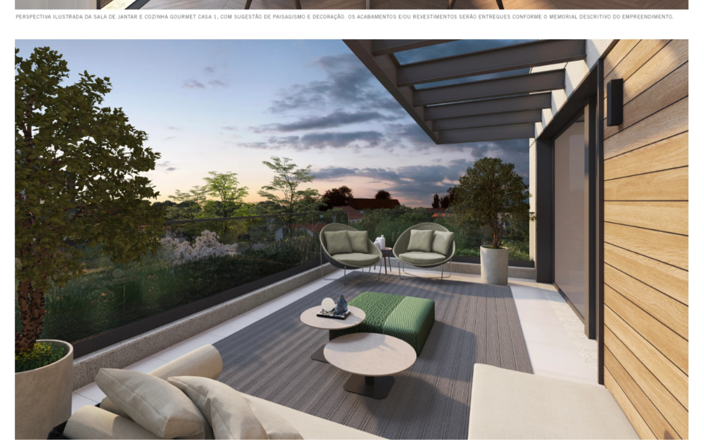
As casas
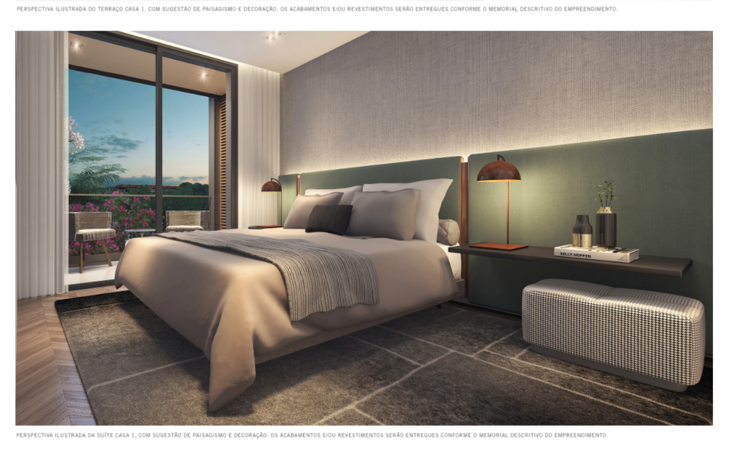
A seção das casas era onde a qualidade das renders de arquitetura precisava brilhar. O desafio era deixar as imagens ocuparem o máximo de espaço possível sem transformar o site num slideshow genérico. Optei por uma estrutura que intercalava fichas técnicas minimalistas com renders em full-bleed — o número da casa em destaque tipográfico grande, as informações em colunas discretas, e as imagens tomando conta.


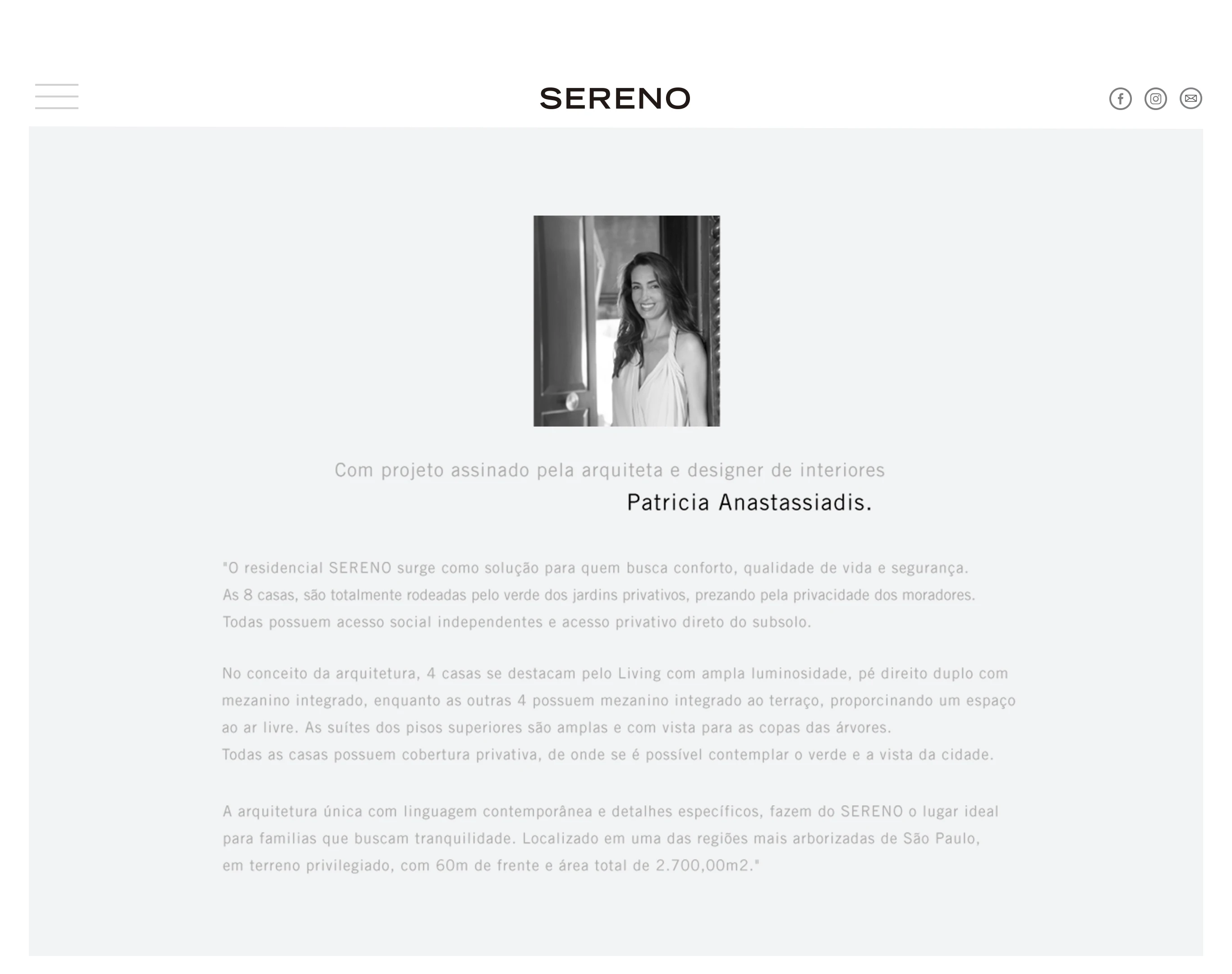
A arquiteta
Patricia Anastassiadis tem nome e presença. A seção dedicada a ela foi construída com cuidado — foto em preto e branco, texto assinado por ela, e o subtítulo da assinatura do projeto como elemento editorial. Simples, mas preciso.

Os impressos
O book de vendas foi onde mais senti o peso do projeto. Peças assim chegam nas mãos de quem pode (e vai) analisar cada detalhe. Papel escolhido a dedo, diagramação com espaçamento cirúrgico, fotos das renders no máximo de resolução. O folder e os materiais de stand seguiram a mesma linguagem do site — consistência entre digital e físico era inegociável.
O resultado
O site foi ao ar, os materiais foram entregues, e o empreendimento foi vendido. Simples assim. As 8 casas foram comercializadas, e o site saiu do ar depois — provavelmente quando o último comprador assinou o contrato. Faz sentido: para um empreendimento desse porte, o site existe para vender, não para permanecer.
O que ficou foi a experiência. E, pelo que vi numa busca anos depois, pelo menos uma das unidades continuou sendo negociada na faixa de R$ 6,7 milhões no mercado secundário.
O que eu aprendi
Restrição é diretriz, não limitação. Quando o produto é excelente e o briefing é "faça jus ao que já existe", você não inventa — você edita. Aprendi que às vezes o melhor design é aquele que sai do caminho do produto.
Consistência entre digital e impresso é mais difícil do que parece. Garantir que o book de vendas e o site pareciam pertencer ao mesmo universo — com diferentes limitações técnicas de cada mídia — foi um exercício que moldou como penso em identidade de comunicação até hoje.
Mercado imobiliário de luxo tem uma régua de qualidade específica. Não é sobre ser bonito. É sobre ser impecável. Uma vírgula fora do lugar num folder que vai para a mão de alguém que gasta R$ 6 mi em uma casa é inaceitável. Esse nível de exigência me fez crescer rápido.

The context
When I joined Urca Design in early 2017, I was still figuring out what real design work looked like — beyond courses, Dribbble shots, and saved references. The agency was small and boutique, specializing in real estate. And SERENO was, without exaggeration, the project that shaped how I think about design to this day.
The development itself was already exceptional: 8 exclusive homes in Alto de Pinheiros, São Paulo's most tree-lined neighborhood according to MIT Senseable City Lab data. Architecture and interiors by Patricia Anastassiadis, one of Brazil's most respected architects. Developed by JAL, with participation from Alfa Realty, Cariba, and Moriah. Homes ranging from 473 to 516m², with 4 bedrooms, private underground garages, and exclusive rooftop coverage. One of the units later appeared on Viva Real for R$ 6.7 million. Not every day you get to work in that universe.
The challenge
The product sold itself — flawless architecture, prime location, a heavyweight name behind the design. What SERENO needed was a digital presence and printed materials that could hold their own. Nothing that looked like another generic real estate launch with "beige sofas and serif fonts." It had to be refined. Different. Worthy of Patricia Anastassiadis.
The website needed to function like an architecture editorial, not a sales microsite. The idea was to tell the story of the development — the neighborhood, the architecture, the spaces — in a way that visitors would feel the caliber before even seeing a floor plan.
The printed materials: sales book, stand materials, folder, diagrammed floor plans. Pieces that would be handed directly to potential buyers with ultra-high-net-worth profiles. Heavy-stock paper, impeccable finishing, zero margin for error.


The process
Visual identity on the web
The color palette came almost naturally from the development's concept: warm off-white as the base, moss green referencing the dense trees of Alto de Pinheiros, and charcoal for typography. The chosen typeface was geometric, spaced, neutral — deliberately without excessive personality, letting the images and the product speak. The SERENO wordmark in uppercase with generous tracking said everything about the positioning.
The hero was a woven palm leaf fan — a handcrafted, understated, high-end object — centered on a near-white background. Nothing else. No text beyond the name. The sophistication lived precisely in what wasn't there.
[IMAGE: coverTop_2x.jpg — site hero with the rendered palm leaf and SERENO wordmark]
For the front-end, I used HTML, CSS, and jQuery with UIKit as the base framework. Scroll logic, section transitions, and interaction microdetails were all built to reinforce a sense of fluidity — like leafing through a high-end architecture magazine, not navigating a website.

Information architecture
The site didn't have a conventional product page. Each section was a layer of the story: first the neighborhood (the MIT map highlighting Alto de Pinheiros as the city's most tree-lined district), then the development, then the homes, then the architect, then the developers, then contact.
The Green View Index section with São Paulo's low-poly map was one of the moments I'm most proud of in this project. Turning a scientific dataset — the street tree canopy index compiled by MIT Senseable City Lab — into a visual element of the product's identity. Not just information. A selling argument wrapped in design.

The homes
The homes section was where the architectural renders needed to shine. The challenge was giving the images maximum real estate without turning the site into a generic slideshow. I opted for a structure that alternated minimalist spec sheets with full-bleed renders — the home number in large typographic display, specs in discreet columns, and images taking over the viewport.


The architect
Patricia Anastassiadis has a name and a presence. The section dedicated to her was built with care — black-and-white portrait, text signed by her, and the project attribution as an editorial element. Simple, but precise.
The printed materials
The sales book was where I felt the weight of the project most. Pieces like that end up in the hands of people who will (and do) analyze every single detail. Paper chosen deliberately, layout with surgical spacing, renders at maximum resolution. The folder and stand materials followed the same visual language as the website — consistency between digital and physical was non-negotiable.
The outcome
The site went live, the materials were delivered, and the development sold out. Simple as that. All 8 homes were sold, and the site eventually came down — probably when the last buyer signed the contract. That makes sense: for a development of this caliber, the website exists to sell, not to stay up forever.
What remained was the experience. And from what I found years later, at least one of the units was still being traded at R$ 6.7 million on the secondary market.
What I learned
Constraint is direction, not limitation. When the product is excellent and the brief is "do justice to what already exists," you don't invent — you edit. I learned that sometimes the best design is the one that steps out of the product's way.
Consistency across digital and print is harder than it looks. Ensuring the sales book and the website felt like they belonged to the same universe — despite the different technical constraints of each medium — was an exercise that has shaped how I think about communication identity ever since.
Luxury real estate has its own quality standard. It's not about being beautiful. It's about being flawless. A misplaced comma in a folder handed to someone spending R$ 6M on a home is unacceptable. That level of demand made me grow fast.
Todo o conteúdo, imagens e materiais apresentados neste case são de autoria de Victor Oliveira Franco e/ou das empresas para as quais foram produzidos. A reprodução, cópia ou distribuição sem autorização prévia e expressa está sujeita a medidas legais conforme a legislação de direitos autorais vigente.
All content, images and materials presented in this case study are authored by Victor Oliveira Franco and/or the companies for which they were produced. Reproduction, copying or distribution without prior and express authorization is subject to legal action under applicable copyright law.